
Programming & Tech
Joomla mobile website
Array
Product SKU: PTJMW
Product Info
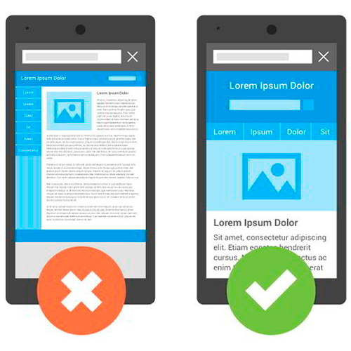
Joomla is a content management system (CMS) that enables you to create and manage websites. When developing a mobile-friendly website with Joomla, you can use responsive templates, mobile-friendly extensions, configure mobile menus, optimize media, conduct mobile testing, implement mobile SEO practices, and optimize content for mobile users. It's important to consider your target audience's mobile behavior and preferences throughout the design and optimization process.
Description
-
Joomla is a popular content management system (CMS) that allows you to create and manage websites. When it comes to creating a mobile-friendly website with Joomla, there are a few key considerations and options available to you. Here's a general overview:
-
Responsive Templates: Joomla offers a wide range of responsive templates that automatically adjust their layout and design based on the screen size of the device accessing the website. You can browse through the Joomla Extensions Directory (JED) or various third-party template providers to find responsive templates suitable for your needs.
-
Mobile-Friendly Extensions: Joomla has a vast extension ecosystem that includes various plugins and modules to enhance the functionality and appearance of your website. Look for extensions that specifically focus on mobile optimization, such as mobile menu modules, touch-friendly image galleries, or mobile content sliders.
-
Mobile Menu Configuration: A crucial aspect of mobile optimization is ensuring your website's navigation is user-friendly on smaller screens. Joomla provides options to configure menus and their behavior for mobile devices. You can customize the menu layout, toggle display options, and choose between off-canvas, dropdown, or accordion-style menus to improve mobile navigation.
-
Media Optimization: Optimize your images and media files for mobile devices to reduce load times and improve user experience. Use compressed image formats and consider implementing lazy loading techniques, where images are loaded only when they come into view.
-
Mobile Testing: It's essential to test your Joomla website on various mobile devices and screen sizes to ensure proper functionality and responsiveness. You can use browser developer tools, online emulators, or physical devices for testing.
-
Mobile SEO: Implementing best practices for mobile search engine optimization (SEO) is crucial. Ensure your mobile website follows SEO principles such as responsive design, fast loading times, proper meta tags, and mobile-friendly URLs.
-
Content Optimization: Adjust your content to suit mobile users. Keep paragraphs concise, use headings and subheadings, and avoid large blocks of text. Break content into easily digestible chunks to improve readability on smaller screens.
Remember, Joomla provides a framework for creating mobile-friendly websites, but the actual implementation and optimization depend on your chosen template, extensions, and content. Always consider your target audience's mobile behavior and preferences when designing and optimizing your Joomla mobile website.
-
About
Professional services
Help and support
Terms